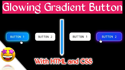
Gradient button HTML:
Do you know? In this world, more people/developers would like to create
glowing and gradient buttons for their websites or apps. Because they are shiny,
beautiful, and attractive. These buttons make the website very beautiful. If
you are looking for Glowing and Gradient Button source code then this place is
right for you.
So, on this page, you will get the
full source code of the HTML glowing gradient button animation
effects on hover with pure CSS. Which looks awesome and attractive. You don't need to
use JavaScript. You will get 2 buttons in different colors.
Program info:
|
Project
Name |
Glowing
gradient button animation effects on hover (gradient button HTML) |
|
Details |
These buttons are made with only HTML
and CSS. These buttons are having very easy and simple codes. Features of
these buttons are when we hover on these buttons the glowing gradient animation
effect will appear and also they do some changes in their size. |
|
Type |
HTML
and CSS |
|
Published by |
Codes Gallery |
|
Developer |
Chetan
Bedakihale |
Watch the tutorial :
HTML code:
<!DOCTYPE html>
<html lang="en">
<head>
	<title>Glowing gradient button</title>
	<link rel="stylesheet" href="buttonstyle.css">
</head>
<body>
	<a href="#" id="button1">BUTTON 1</a>
	<a href="#" id="button2">BUTTON 2</a>
</body>
</html>
*{
	       margin:0;
	       padding:0;

   }

 body{
		background:black;
		font-family:monospace;
   }

 #button1{
		background:#FAFAFA;
		position:absolute;
		top:50%;
		left:50%;
		transform:translate(-50%,-50%);
		width:80px;
		margin:0px -70px;
		text-decoration:none;
		color:black;
		text-align:center;
		border:1px Solid #EEEEEE;
		border-radius:10px;
		padding:10px;
		font-size:15px;
		transition-property:width;
		transition-duration:0.5s;
   }

#button1:hover{
		background:linear-gradient(90deg,#0063D9,#0092FD,#00CEFD,#00F1FD,#0063FD);
		width:100px;
		text-align:center;
		background-size:400%;
		color:white;
		animation:animate 8s linear infinite;
		box-shadow:0 0 2px #0063D9, 0 0 6px #0092FD, 0 0 10px #00CEFD, 0 0 14px #00F1FD;

   }

#button2{
		background:#FAFAFA;
		position:absolute;
		top:50%;
		left:50%;
		transform:translate(-50%,-50%);
		margin:0px 70px;
		width:80px;
		text-decoration:none;
		color:black;
		text-align:center;
		border:1px Solid #EEEEEE;
		border-radius:10px;
		padding:10px;
		font-size:15px;
		transition-property:width;
		transition-duration:0.5s;
   }

#button2:hover{
		background:linear-gradient(90deg,#AA00FF,#0050EF,#6A00FF,#AA00FF);
		width:100px;
		text-align:center;
		background-size:400%;
		color:white;
		animation:animate 8s linear infinite;
		box-shadow:0 0 2px #AA00FF, 0 0 6px #0050EF, 0 0 10px #6A00FF, 0 0 14px #AA00FF;

   }

@keyframes animate{
			from{
					background-position:0%;
				}
			to{
					background-position:400%;
				}
}


Post a Comment
You are welcome to share your ideas with me in the comments!